Case study
Slottsskogens Hotel & Hostel
Reducing friction in a hostel/hotel booking experience
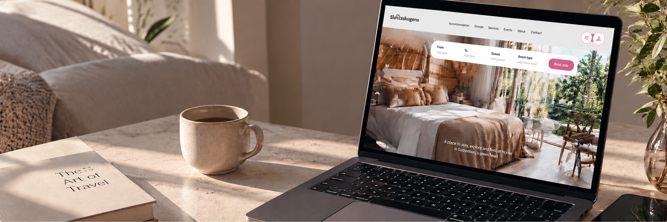
Slottsskogens Hotel & Hostel is an independent accommodation provider in Gothenburg. Guests could already book directly through its website, but usability testing showed that the experience was creating friction at almost every stage, from choosing dates and rooms to understanding add-ons and navigating back out of the booking flow.
The business also had a clear incentive to improve the experience: direct bookings reduced reliance on third-party platforms such as Booking.com and Hostelworld.
I worked with another designer to understand where users were struggling and redesign the booking journey, navigation and supporting content.
Role
UX Design Intern
What I worked on
Competitive analysis · User research · Usability testing · Heuristic evaluation · Information architecture · User flows · Wireframing · UI design
Platform
Responsive web
Click an image to enlargeTap an image to enlarge
01 / Research
Where was the booking experience breaking down?
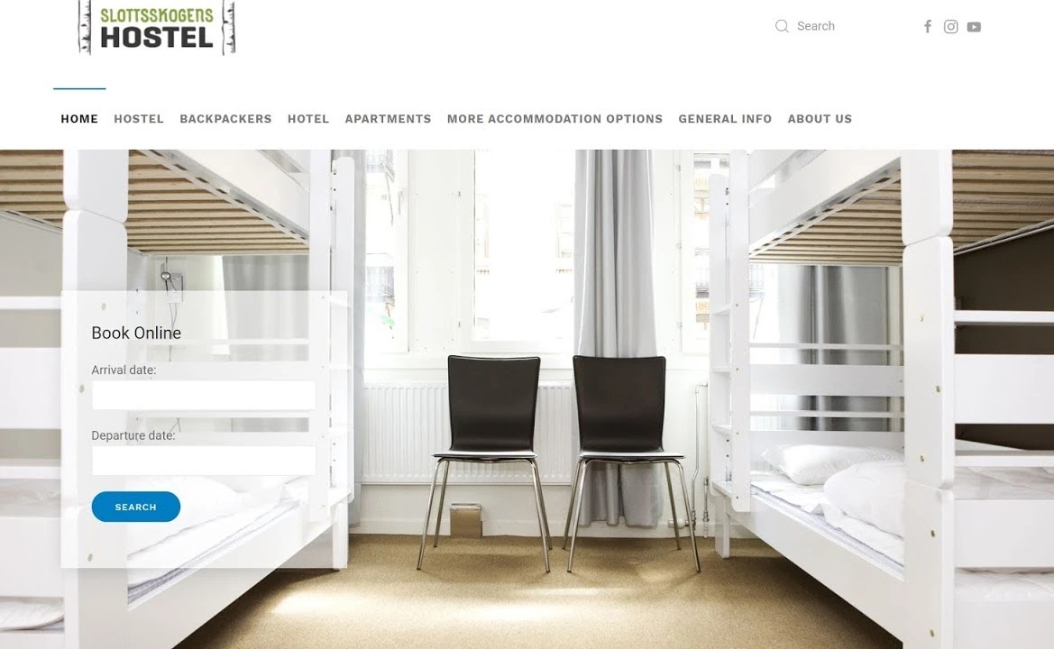
I started by testing the existing website with 7 frequent travellers across different age groups, nationalities and professions.
The problem was not one isolated interaction. Users were encountering friction throughout the journey.
What stood out
100% found the date picker confusing or non-functional.
100% were unsure whether they were selecting a private room or a shared dorm.
Users needed more than 10 clicks to find information about the hostel’s social events; 57% needed more than 13.
100% struggled with low-contrast text on the homepage.
During booking, parts of the experience unexpectedly switched to Swedish, causing some users to abandon the flow.
On a scale from 1–10, no participant rated the existing booking experience above 4.
The pattern was clear: users were not failing because of one bad screen. The experience lacked clarity, consistency and predictable navigation across the entire journey.
User: “That’s it, I give up. There are other hostels.”
Direct booking still mattered
A separate survey helped us understand how hostel guests chose accommodation and what might persuade them to book directly.
82.4% researched the hostel further after initially finding accommodation through a third-party platform.
64.7% attempted to book directly when it offered a better price.
94.1% cited affordability as an important reason for choosing hostels.
88.2% said they would join a loyalty programme offering discounts to returning guests.
64.7% were more likely to stay somewhere offering social activities.
This suggested that the website was not simply a transactional checkout. It played an important role in helping users decide whether the hostel itself was worth choosing.
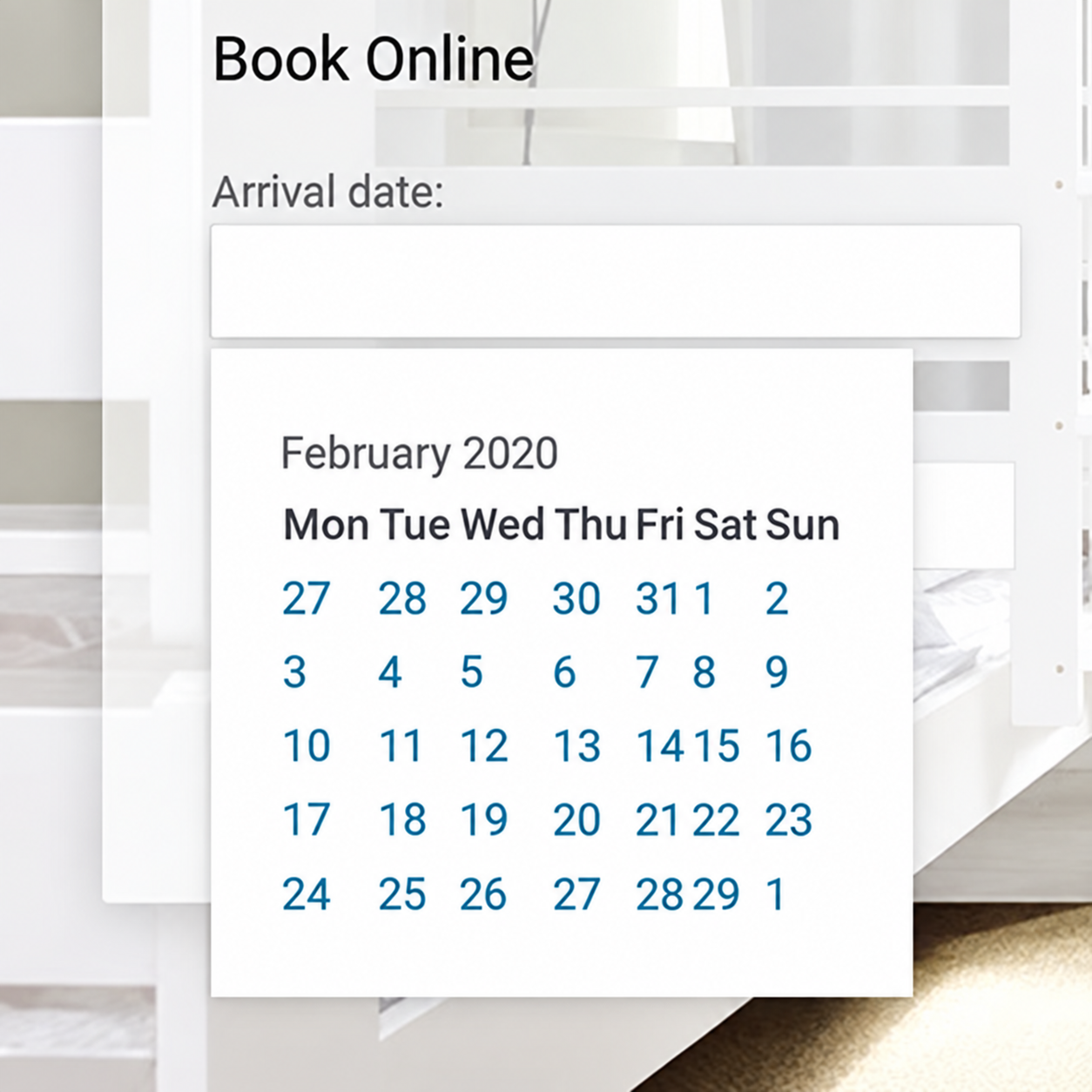
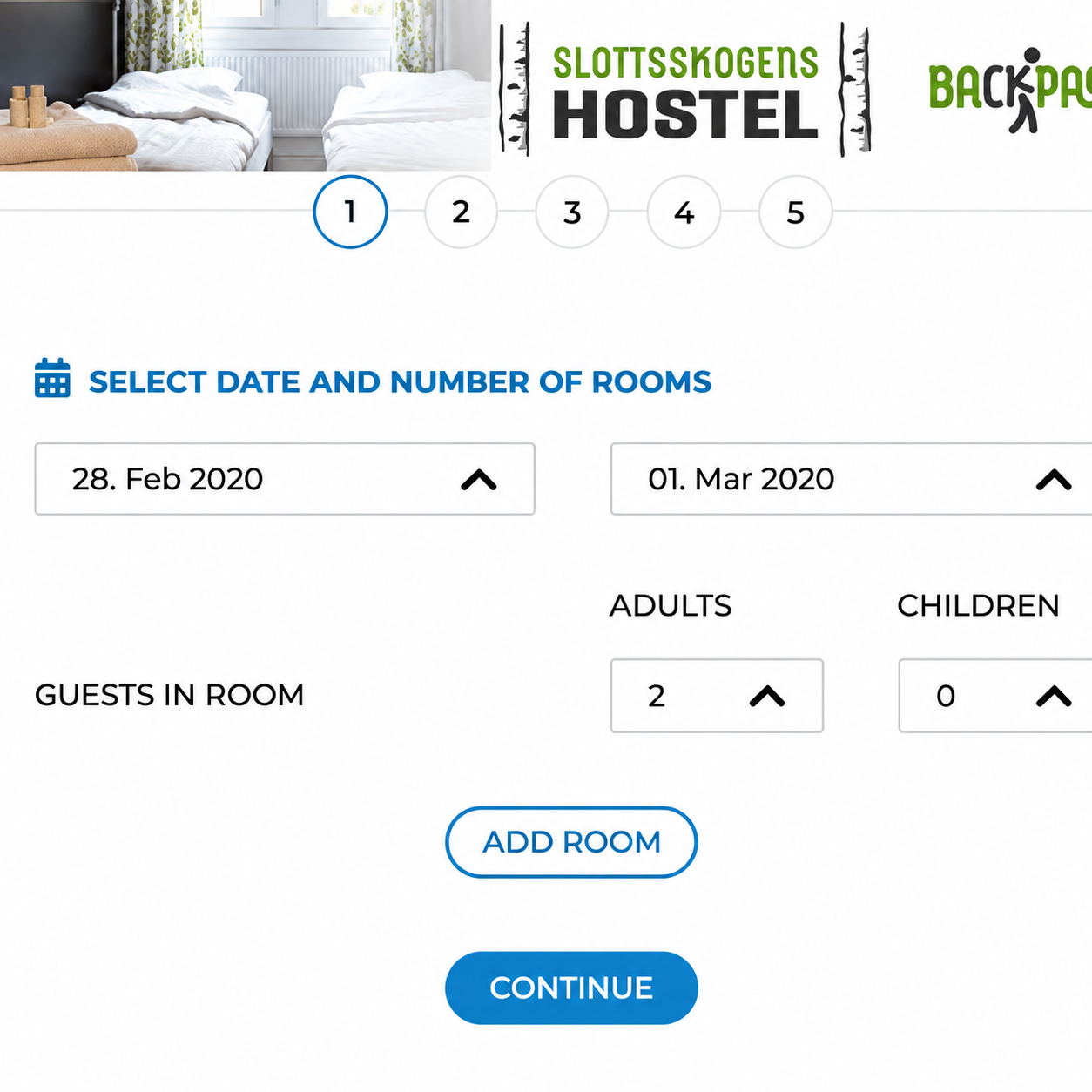
Homepage date picker
Users could not easily move between months, past dates remained selectable, and future bookings sometimes required manually entering dates.
The second date picker
After choosing dates once, users were asked to select them again later in the booking flow because their previous selection had been reset.
Click an image to enlargeTap an image to enlarge
Other usability issues we found
The date picker was only one part of a much broader usability problem. Testing and evaluation also revealed that:
Room types were unclear. Users could not reliably distinguish private rooms from shared dorms before reaching checkout.
Language and currency were inconsistent. Parts of the booking flow unexpectedly appeared in Swedish, while prices remained in SEK regardless of the selected language.
Users could feel trapped in the booking flow. There was no obvious route back to the homepage once checkout had started.
Forms created unnecessary friction. Inputs lacked clear labels, formatting and inline validation.
Add-ons lacked context. Users were shown extras such as the Gothenburg Pass without enough information to understand what they were purchasing.
Social events were difficult to find. Users frequently became lost while looking for information that was important to their accommodation decision.
Together, these issues pointed to a broader problem with clarity, consistency and navigation rather than a single broken screen.
02 / Design
Key design decisions
Making the booking flow predictable
The existing booking flow repeatedly asked users for information they had already entered, reset previously selected dates and sometimes switched language mid-flow.
Rather than treating those as isolated UI bugs, we redesigned the booking journey as one continuous, predictable process. Dates and guest information remained consistent between steps, users could understand where they were in the flow, and navigation no longer left them feeling trapped.
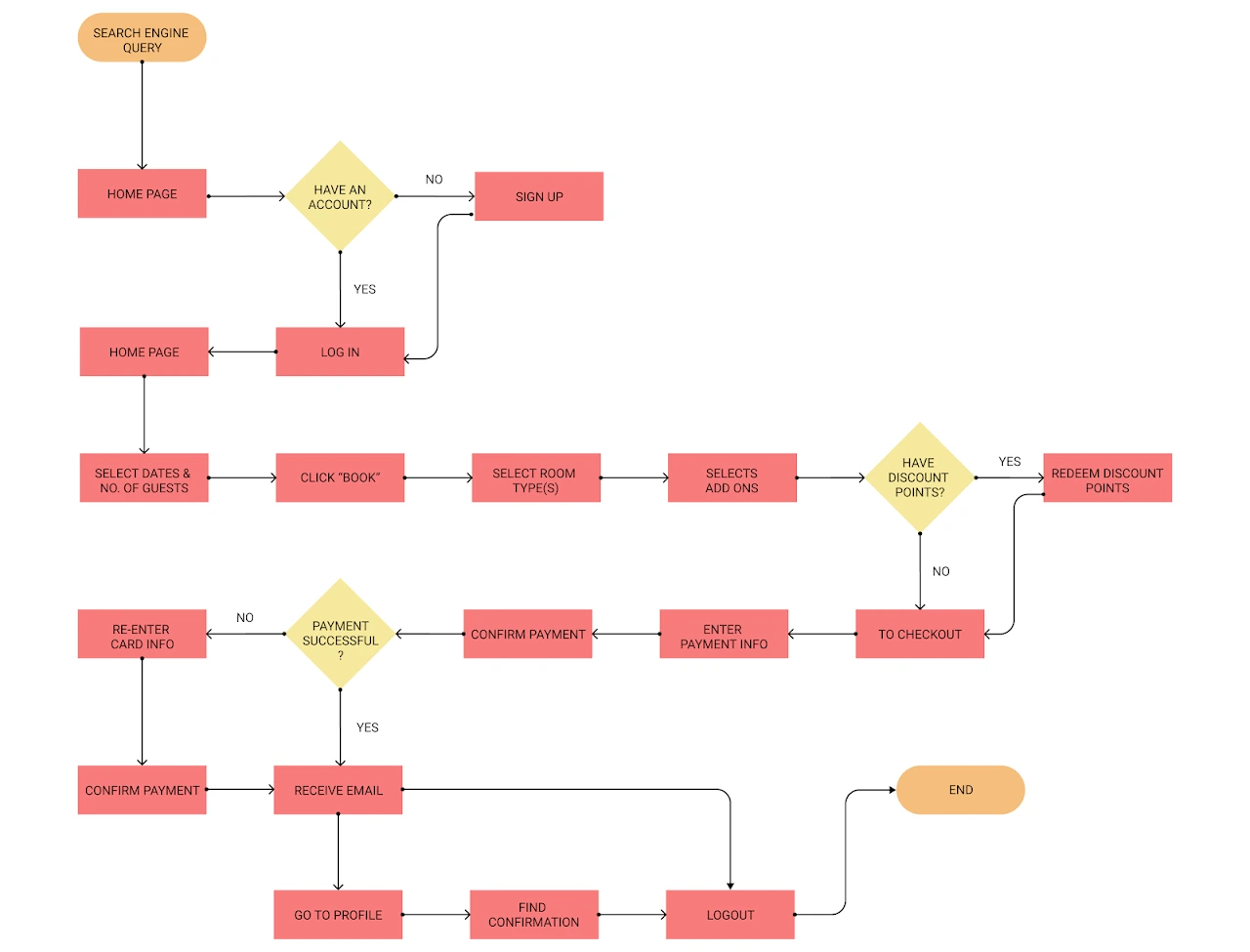
Mapping the redesigned journey from discovery through direct booking.
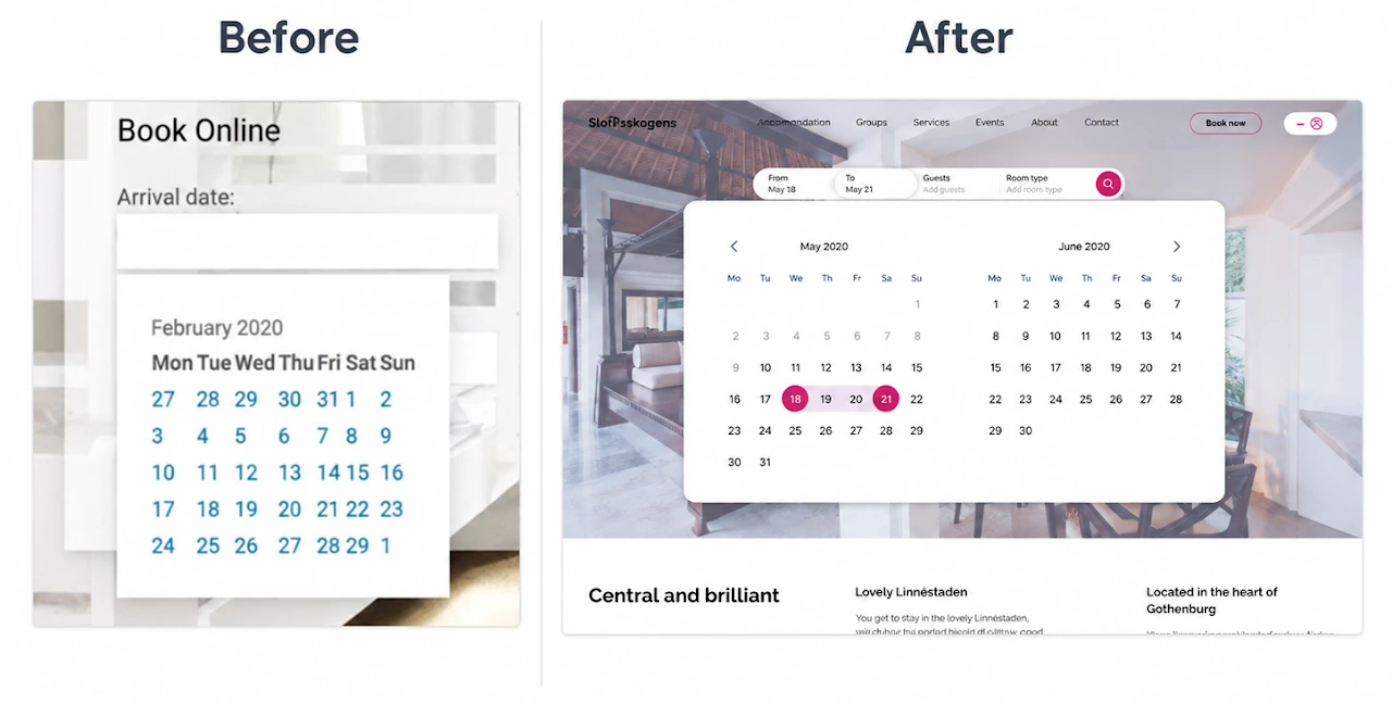
Simplifying date selection and keeping users’ choices consistent throughout the booking flow.
Click to enlargeTap to enlarge
Making room choices easier to understand
Every participant struggled to understand whether they were selecting a private room or a shared dorm.
The redesign made room type, occupancy and pricing easier to compare before users committed to a selection, reducing the risk of reaching checkout with the wrong expectations.
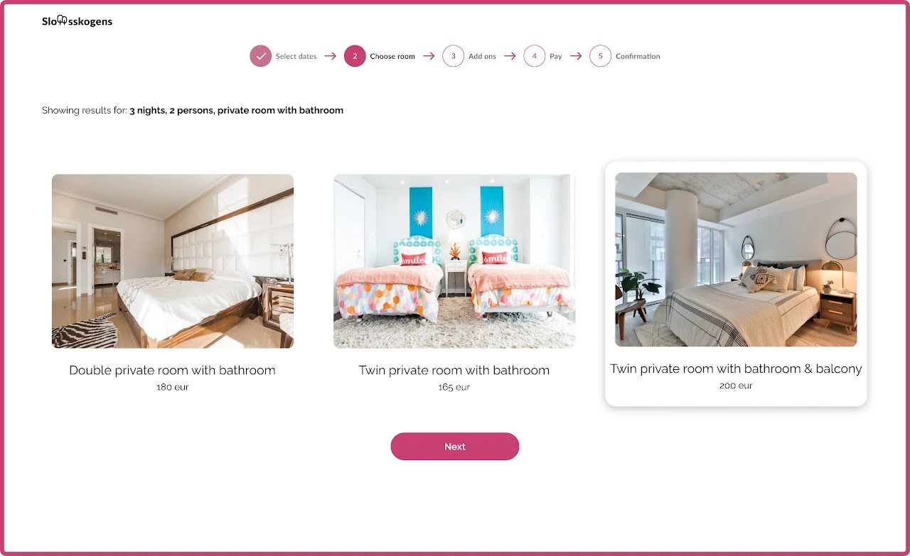
Redesigned room selection with clearer room type, occupancy and pricing information.
Bringing important information out of hiding
Social activities were an important part of how guests evaluated hostels, yet users needed more than 10 clicks to find them on the existing site.
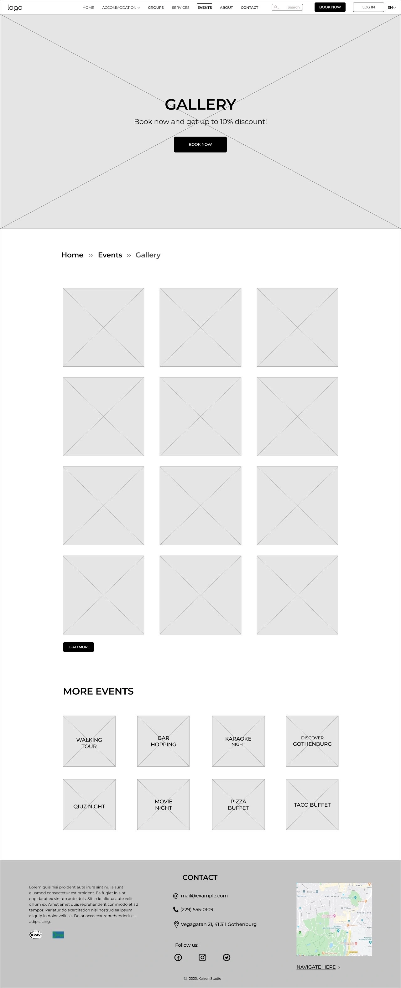
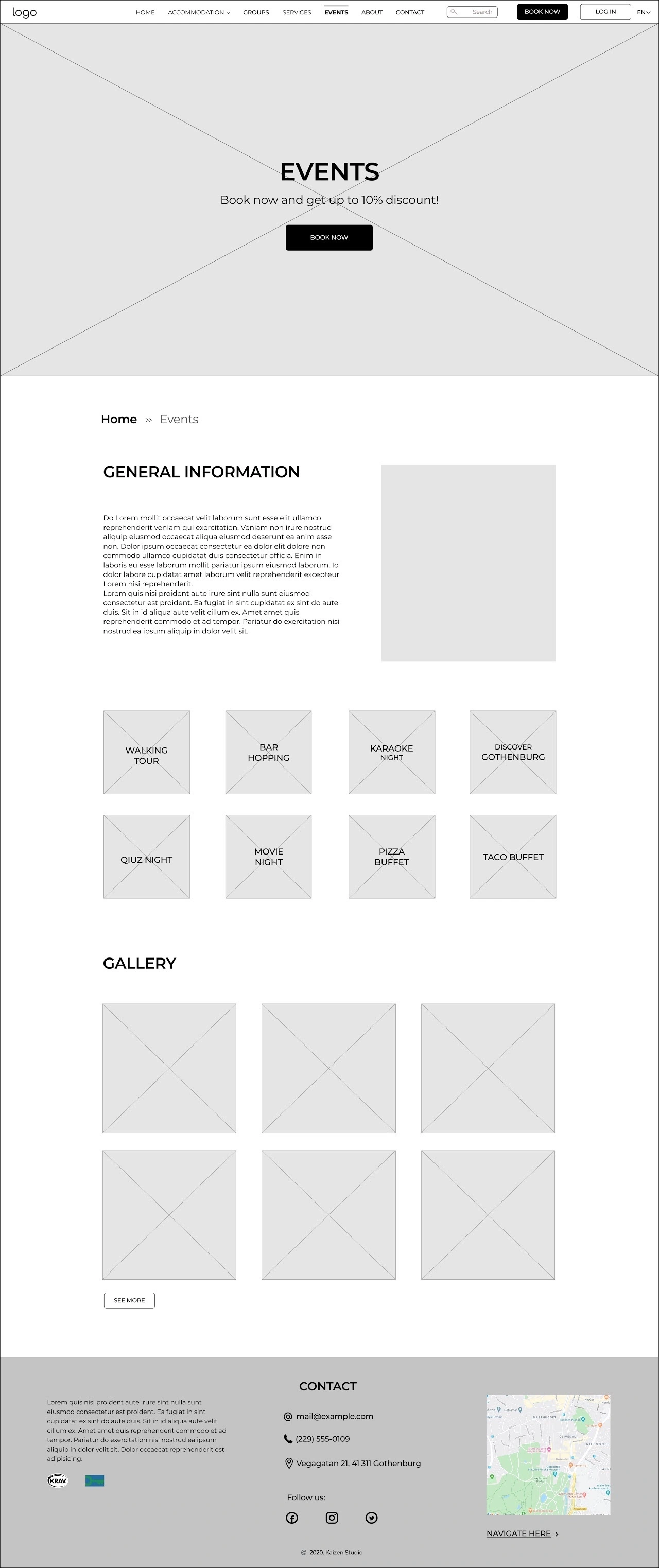
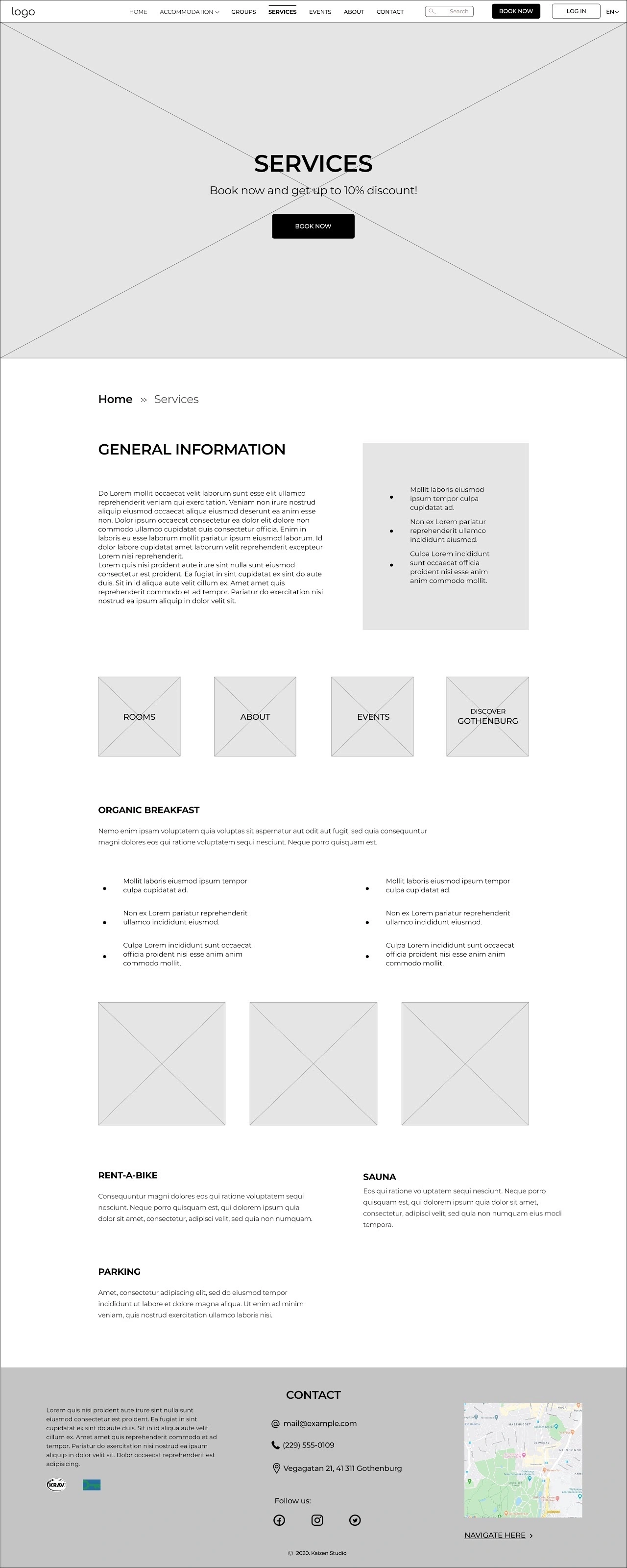
We reworked the information architecture and navigation so important content — including events, accommodation information and frequently requested details — was easier to discover without navigating through deeply nested menus.
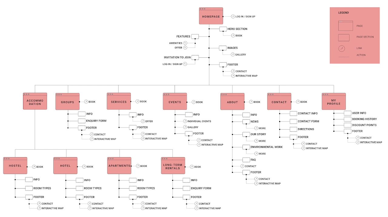
Restructuring the site around the information guests needed most.
Designing for direct and returning guests
The research showed that price strongly influenced hostel selection and that many travellers were willing to book directly when it offered better value.
Stakeholder conversations also revealed that many off-season guests were returning visitors, while the existing discount system was still paper-based.
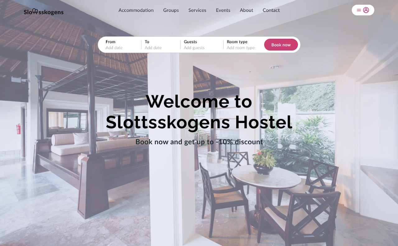
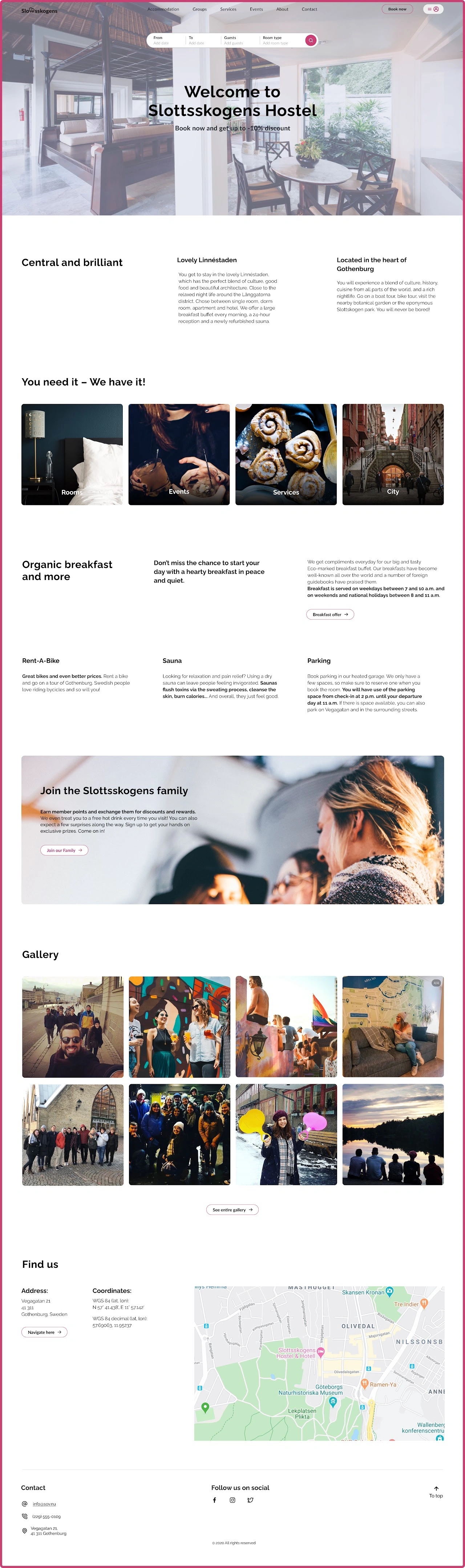
We therefore incorporated a digital loyalty experience into the redesign, giving returning guests a clearer incentive to book directly.
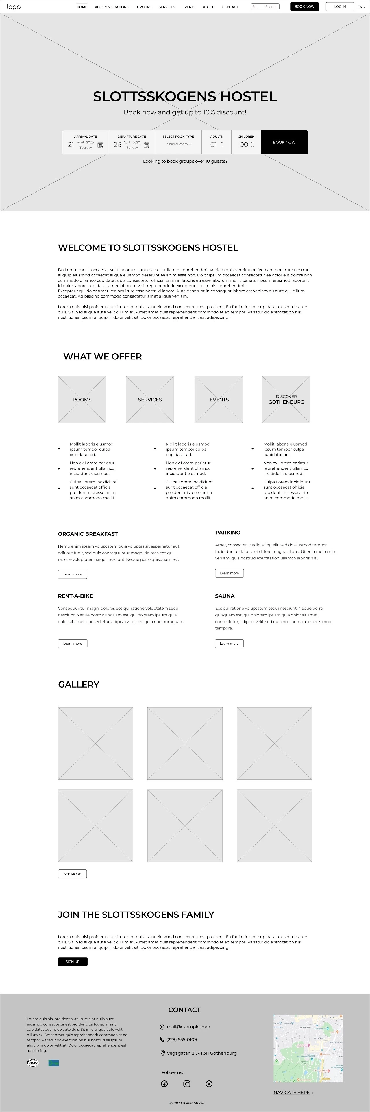
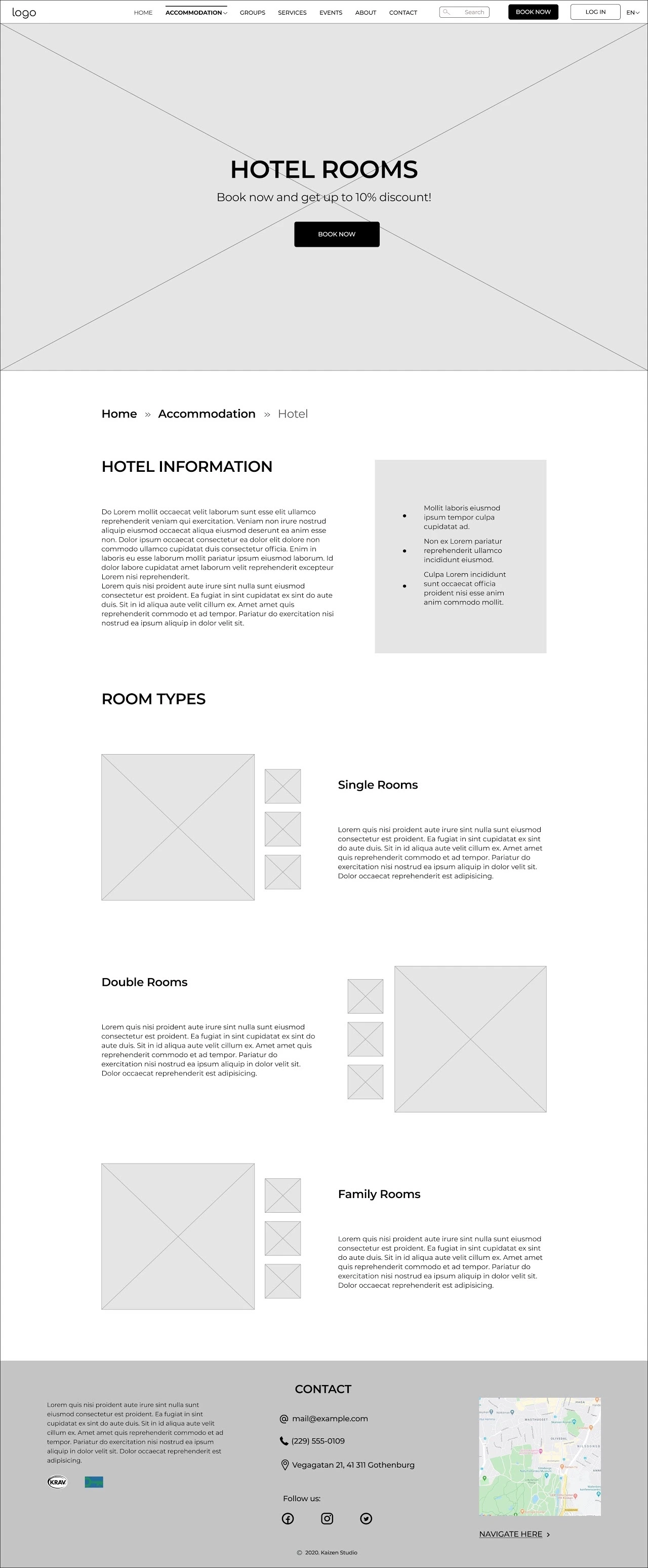
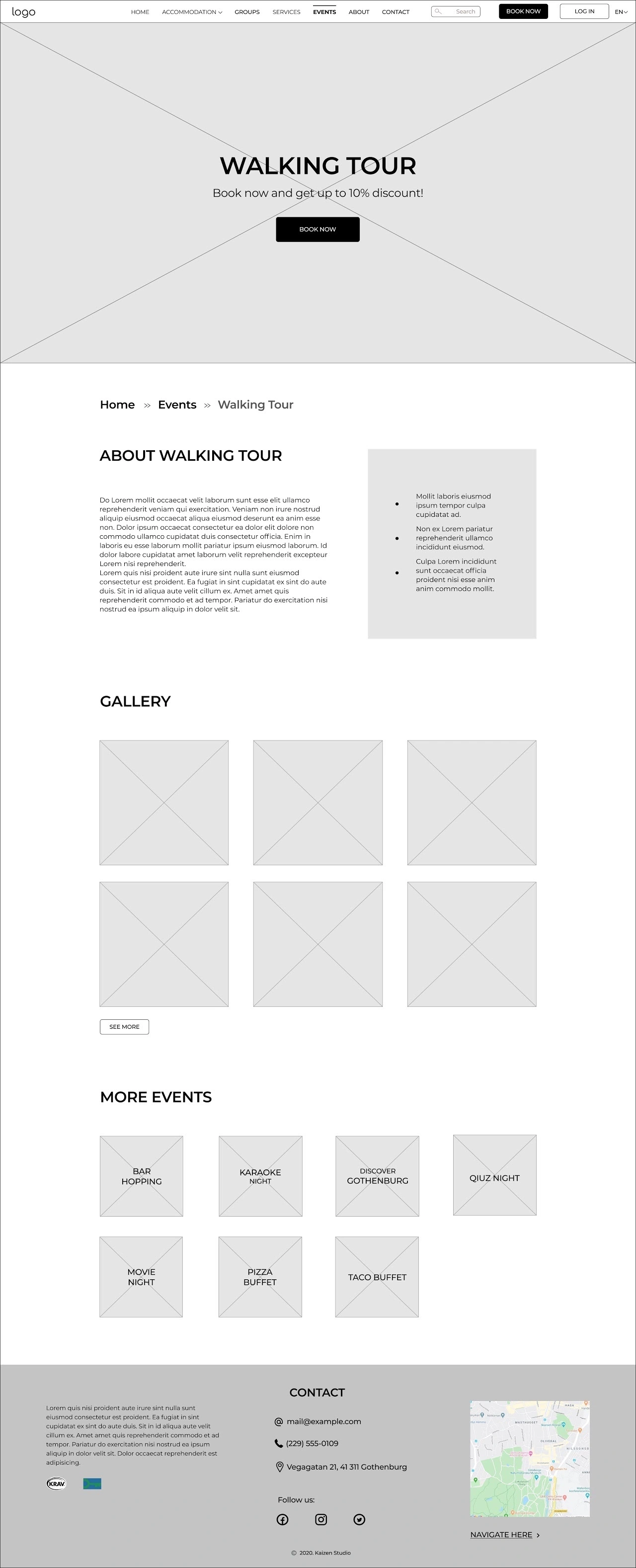
Click an image to enlargeTap an image to enlarge
03 / Final experience
The final experience
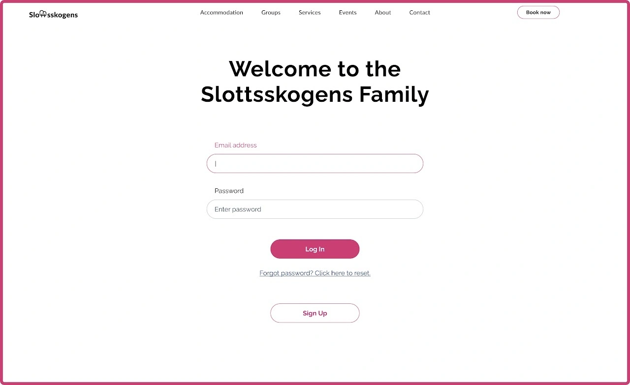
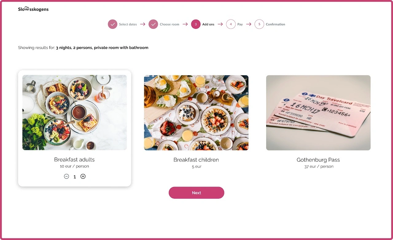
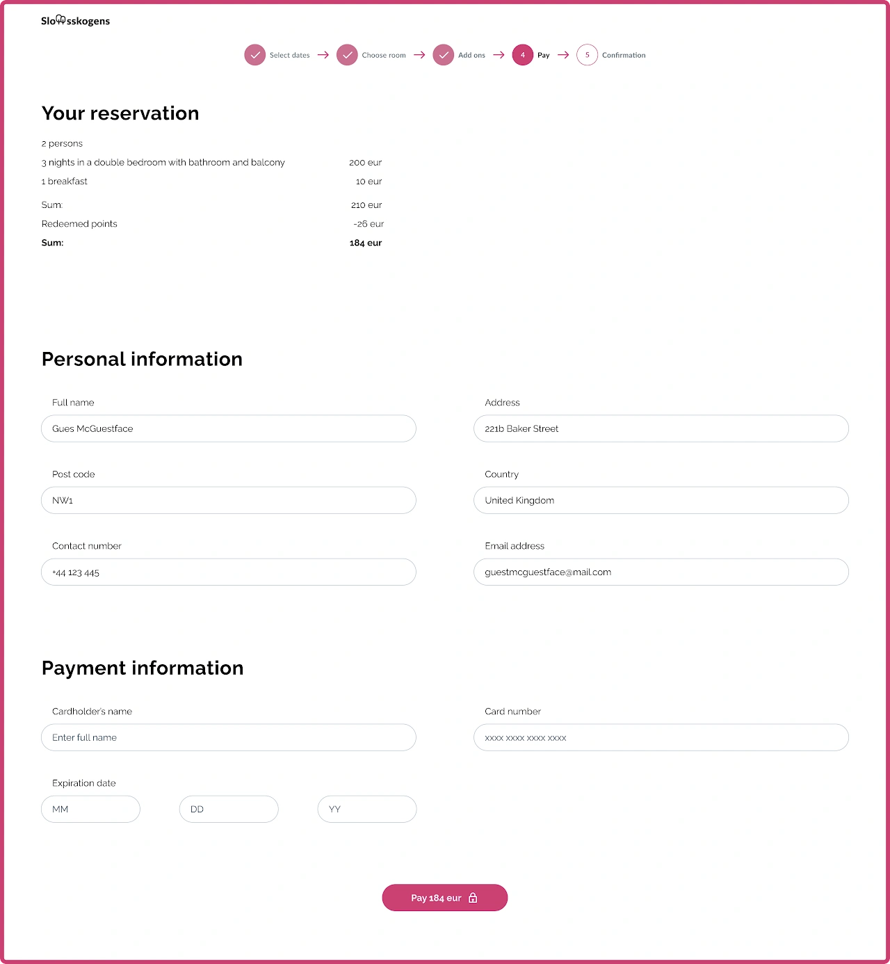
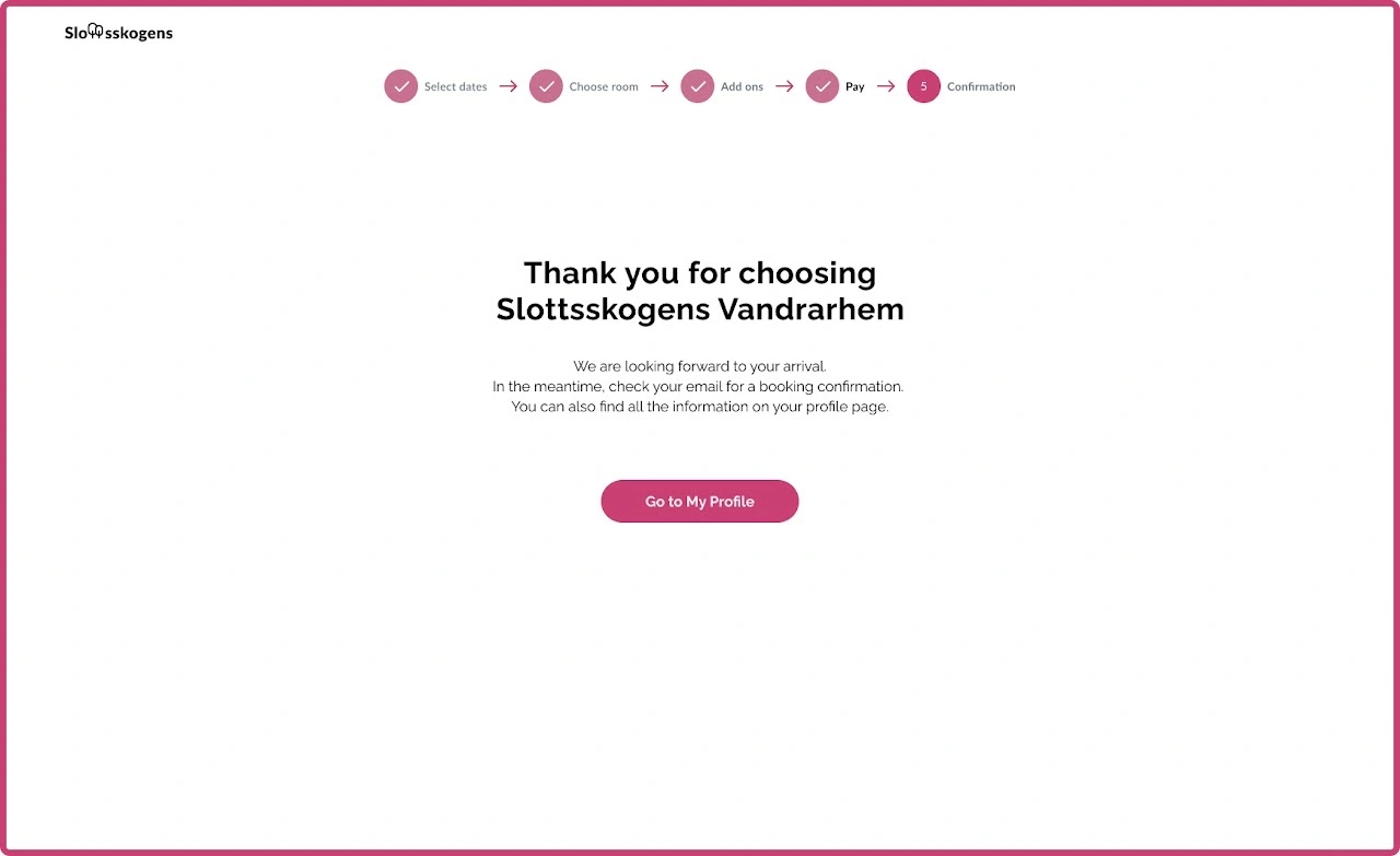
04 / Results
Did the redesign improve the experience?
We tested the redesigned experience using the same core tasks we had used with the original website.
The difference was substantial:
30% improvement
All participants completed the booking flow successfully, representing a 30% improvement in task performance.
Finding information that had previously taken users as many as 13 clicks was reduced to 2.
89% described the redesigned process as straightforward and simple.
The experience received an average rating of 9/10, compared with the original experience, which no participant had rated above 4.
The results suggested that the redesign addressed the major usability problems identified in the original experience, while further testing of areas such as the loyalty system would have been the next step.
05 / Reflection
Looking back
This project was unusual because I had previously worked at the hostel myself. I already knew that guests regularly encountered problems with the booking experience, but the research forced me to separate what I thought I knew from what users were actually experiencing.
The most valuable lesson was how quickly seemingly small interaction problems can compound. A confusing date picker, unclear room labels, hidden information and inconsistent navigation might each appear manageable in isolation, but together they were enough to make users abandon the booking entirely.
The redesign was ultimately not implemented because the project was interrupted by the COVID-19 pandemic. If I were approaching it today, I would prioritize the highest-impact booking issues into a smaller first release and define clearer product metrics around abandonment, direct-booking conversion and repeat bookings. That would make it easier to connect usability improvements to actual business impact rather than evaluating the redesign through usability testing alone.